
Switching Pitchers and Reducing Home Runs
In game 6 of the 2020 world series, the world witnessed one of the most dominant pitching performances of world series history…for the first four innings.
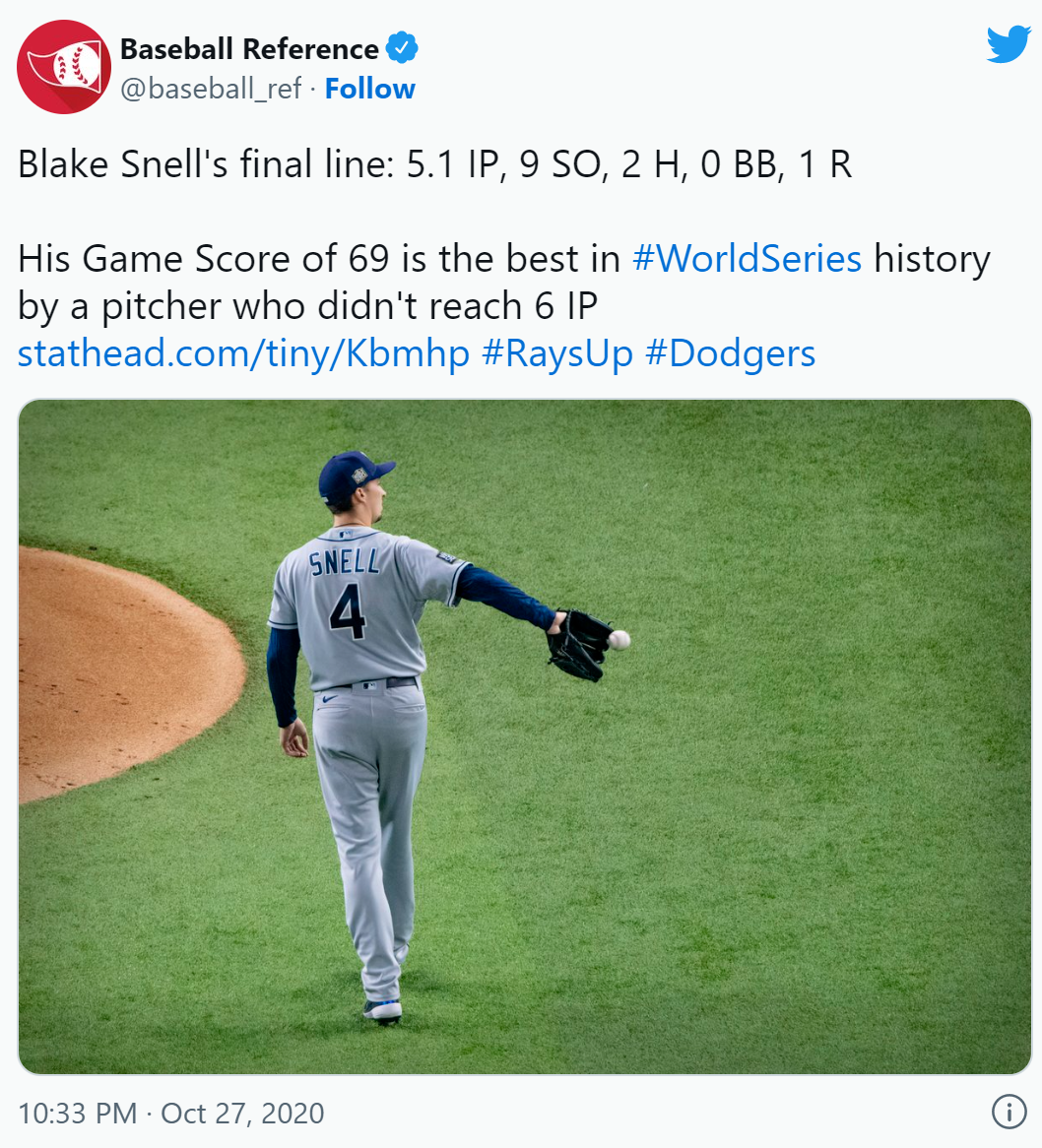 Blake Snell was dominating for the Tampa
Bay Rays, until the 5th inning, when Manager Kevin Cash decided to pull
him out of the game.
Blake Snell was dominating for the Tampa
Bay Rays, until the 5th inning, when Manager Kevin Cash decided to pull
him out of the game.
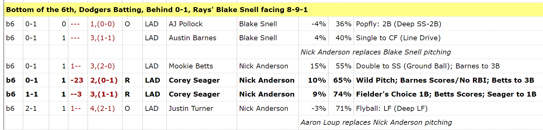
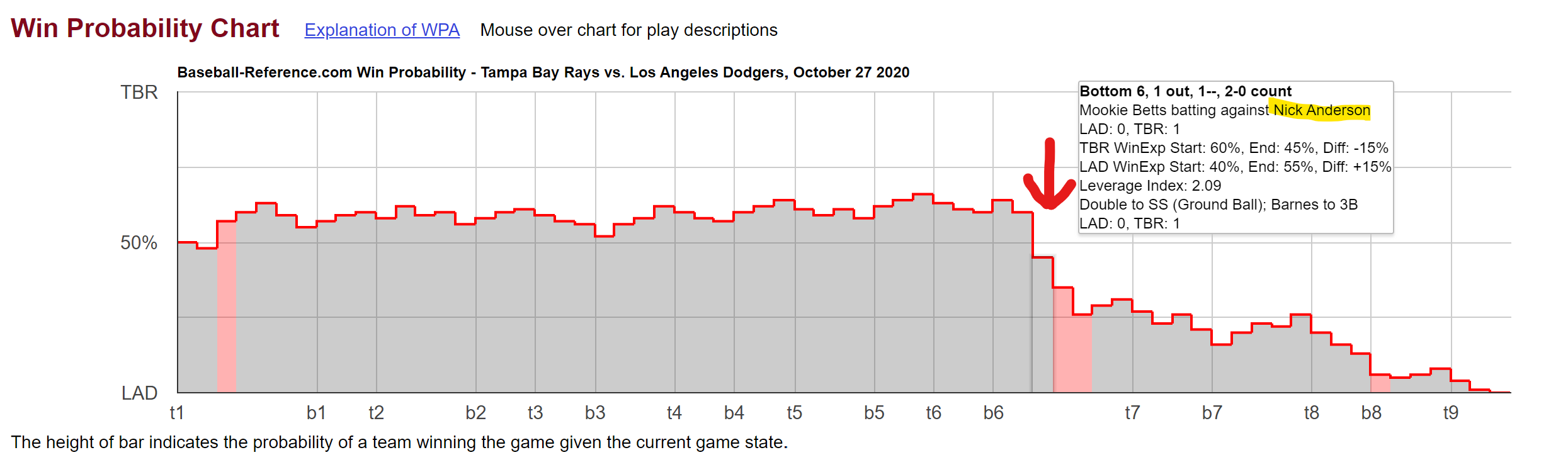
Check out the baseball reference win probability over the course of the
game. Here is the last batter Snell faced:
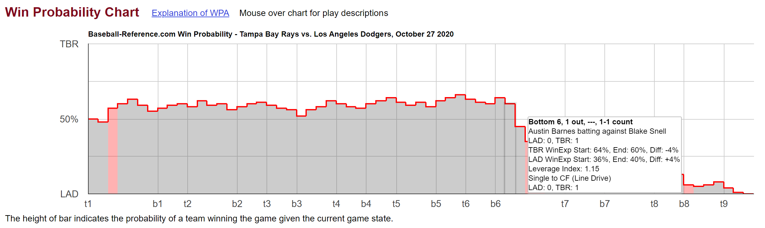
Snell gave up a hit, but the win probability was still in favor of the
Rays beating the Dodgers. It wasn’t until the next batter, the dodger’s
all star Mookie Betts, got a double off of replacement pitcher Nick
Anderson that the win probability shifted to the dodger’s favor
 The Dodgers went on to win the game and
the World Series.
The Dodgers went on to win the game and
the World Series.
The decision to pull Snell was widely criticized and was seen as a major
turning point in the game. Here is how Manager Kevin Cash defended the
decision: 
Now I actually like this defense because it seems like a rational attempt to predict the outcome of the next batter, and more specifically, the difference in predicted outcomes if Snell stays in versus if he comes out. This is what I think all managers should base their pitching decisions on. Though I admit using only one or two predictor variables (in this case number of times through the lineup and quality of next batter) leaves room for improvement.
Side note reminder that machine learning algorithms are able make predictions based on many more predictors than just one - but we’ll get to that later.
Now even though I like Cash’s defense as only being about the next batter, part of me wonders how much he was giving in to what behavioral economists call “availability bias”.
Availability bias (or availability heuristic or recency bias) is the idea that humans treat available information as more relevant than it really is.
In this case Blake Snell had just given up a hit (though it was only his
second of the game) and the recency of that hit must have been weighing
on Kevin Cash’s mind (even if he didn’t admit it).
After that game, I couldn’t stop seeing possible cases of availability bias in the MLB, and like any good data scientist, I decided to take this question to the data.
I started with this figure 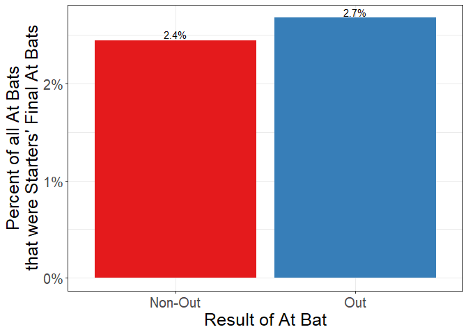 This figure shows the percent of at bats that were a starting pitcher’s
last at bat of the game, split by whether the pitcher got an out on the
previous batter or not. This is a figure about the probability of
getting pulled, conditional on result of the last AB. So among all the
at bats that ended in an out, 2.7% of them were the final at bat for the
pitcher that game. On the other hand, if the pitcher did not get an out,
only 2.4% of those at bats were the pitcher’s final at bat that game.
Now this seems contrary to intuition: shouldn’t a pitcher get pulled
less frequently if he got an out than if he didn’t? The problem with
the above figure is that it includes end-of-inning substitutions. And
100% of those substitutions come after a pitcher got an out (otherwise
the inning wouldn’t be over). These end-of-inning substitutions are the
most frequent kind of substitution, and not what happened to Blake Snell
in 2020. He was pulled mid-inning after not getting an out.
This figure shows the percent of at bats that were a starting pitcher’s
last at bat of the game, split by whether the pitcher got an out on the
previous batter or not. This is a figure about the probability of
getting pulled, conditional on result of the last AB. So among all the
at bats that ended in an out, 2.7% of them were the final at bat for the
pitcher that game. On the other hand, if the pitcher did not get an out,
only 2.4% of those at bats were the pitcher’s final at bat that game.
Now this seems contrary to intuition: shouldn’t a pitcher get pulled
less frequently if he got an out than if he didn’t? The problem with
the above figure is that it includes end-of-inning substitutions. And
100% of those substitutions come after a pitcher got an out (otherwise
the inning wouldn’t be over). These end-of-inning substitutions are the
most frequent kind of substitution, and not what happened to Blake Snell
in 2020. He was pulled mid-inning after not getting an out.
Look at what happens if I limit to mid-inning switches
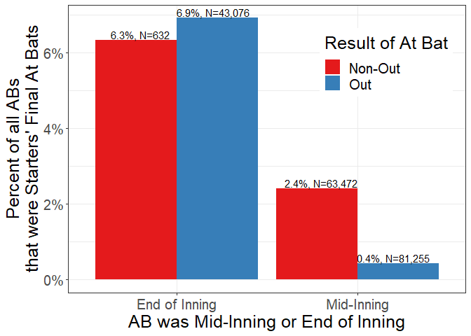 You can see that while
there is less than a 1 percentage point difference for substitutions at
the end of innings between the two different results of the previous at
bats, there is a 2 percentage point difference for substitutions
mid-inning. Maybe those end of inning switches were planned a little
more in advance and have nothing to do with recency bias?
You can see that while
there is less than a 1 percentage point difference for substitutions at
the end of innings between the two different results of the previous at
bats, there is a 2 percentage point difference for substitutions
mid-inning. Maybe those end of inning switches were planned a little
more in advance and have nothing to do with recency bias?
Finally, keeping in mind Kevin Cash’s reasoning for pulling Snell, if I
split by number of times through the lineup:
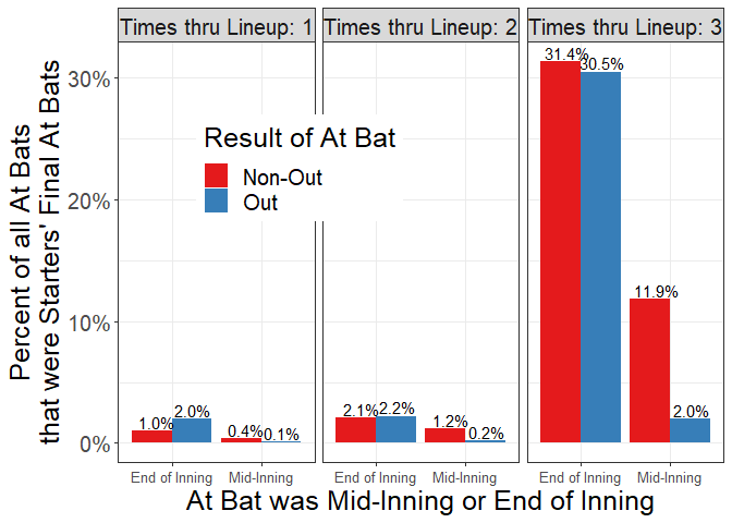
Now you can see a relatively big difference in the probability of being pulled after getting an out versus after not getting an out for the third time through the lineup, and this is exactly where Blake Snell was sitting in game 6 of the 2020 world series. In other words, getting pulled after giving up a hit or a walk the third time through the lineup is a lot more common than getting pulled after getting an out. So it maybe should not have been as big of a surprise for Snell to get taken out since he had just given up a hit.
 But here’s the thing: just
because Blake did not get an out on the last AB (and he was starting his
3rd time through the lineup), we can’t be sure he wouldn’t have gotten
an out on his NEXT batter. This might be Snell’s argument - just because
he just gave up a hit, it was just one of two hits over his whole
outing.
But here’s the thing: just
because Blake did not get an out on the last AB (and he was starting his
3rd time through the lineup), we can’t be sure he wouldn’t have gotten
an out on his NEXT batter. This might be Snell’s argument - just because
he just gave up a hit, it was just one of two hits over his whole
outing.
This version of the plot shows the probability of getting an out
conditional on the outcome of the last AB:
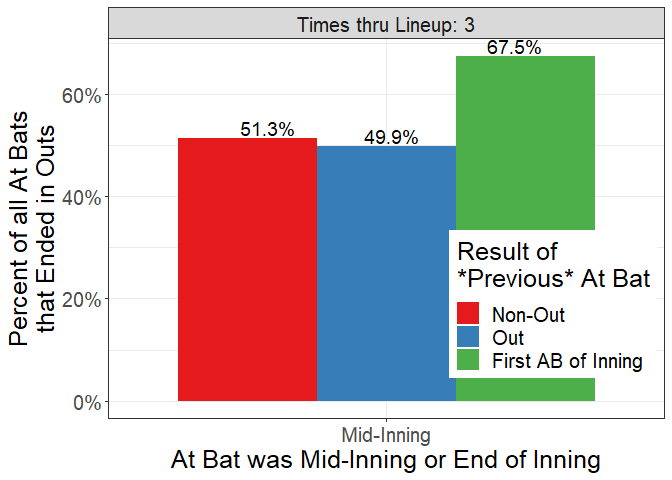 If a pitcher got an out last
AB, on average the current AB will result in an out 49.9% of the time
(versus 51.3% of the time if the last AB did not end in an out). And for
completeness here is the version with all three times through the
lineup:
If a pitcher got an out last
AB, on average the current AB will result in an out 49.9% of the time
(versus 51.3% of the time if the last AB did not end in an out). And for
completeness here is the version with all three times through the
lineup: 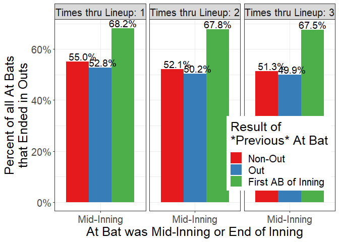
But surely these means mask a lot of heterogeneity - maybe it’s just the case that when Blake Snell gives up a hit, he actually becomes more likely than the average pitcher to give up another. We can test that theory by looking at individual pitcher means.
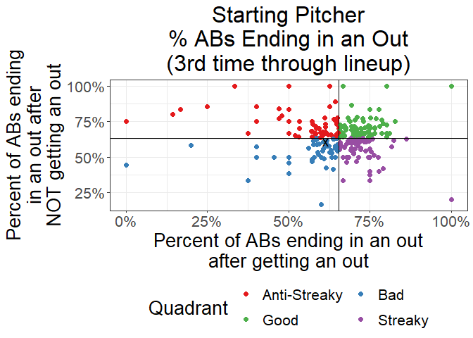
This plot shows the percent of times an individual pitcher gets an out after getting an out on the last batter vs after not getting an out on the last batter - excluding the first AB of an inning. Each point is a pitcher, so the pitchers in the top right quadrant are just more likely to get outs than the average pitchers, regardless of what happened on the past AB. The pitchers on the bottom right quadrant are a little more streaky than the average pitcher - they are more likely to get an out after getting an out on the last batter, but less likely to get an out after giving up a hit on the last batter. The pitchers in the top left are “anti-streaky” they get outs after giving up hits and give up hits after getting outs. And finally the pitchers in the bottom left quadrant are less likely than the average pitcher to get outs regardless of what happened on the last AB. I boldly labeled them “bad” here…but there’s a lot going on here- for example this is the 3rd time through the lineup and the cutoff between bad and good is pretty sharp - if you are slightly below average this labels you as bad vs if you are slightly above average this labels you as good. This X shows Blake Snell. It looks like he is…about average. After getting an out, he is actually a little less likely than the average pitcher to get another out. But after NOT getting an out, he is about as likely as the average pitcher to get an out on the next batter.
Now compare that plot to this one that shows individual pitcher means
for getting pulled mid inning conditional on the result of the previous
AB: 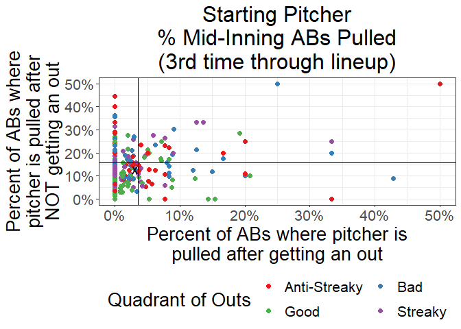
I kept the colors from the last figure so you can see where the pitchers
in the top right quadrant of the outs figure end up in this pulls
figure. In this figure the top right quadrant are the guys getting
pulled most often regardless of what happened in the last AB. The bottom
right are the pitchers that are pulled after getting an out but get to
stay in after giving up a hit (their manager thinks they are the
anti-streaky pitchers). The top left quadrant are pitchers who are
pulled if they give up a hit but left in if they get an out (managers
think they are streaky). And the bottom left quadrant are the pitchers
that managers leave in regardless of what happened on the last AB. What
you might have expected was that the colors here would be in the same
quadrants - that the streaky pitchers should be the ones you take out
after giving up a hit and the anti-streaky hitters are the ones you
leave in after a hit. But there seems to be a bit of a mix:
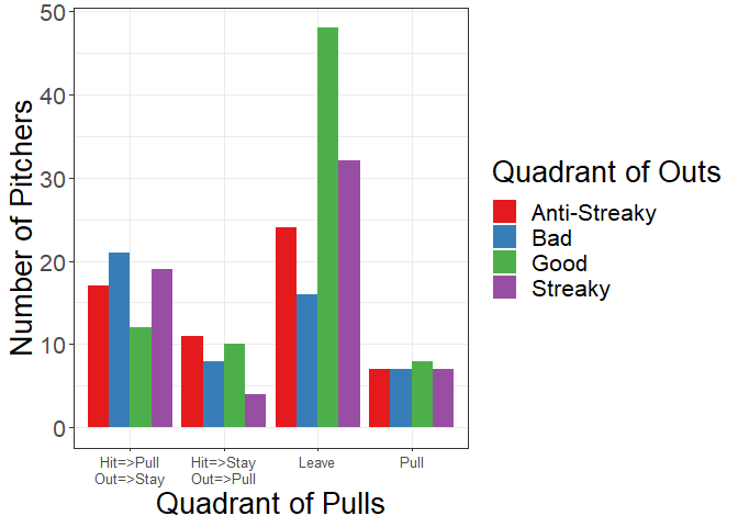
If you look at the breakdown of pitchers by the two sets of quadrants, you can see there are patterns in the right direction -for example the good pitchers are left in the most regardless of what happened on the last batter, and the streaky pitchers are pulled most after giving up a hit (and the anti-streaky pitchers are pulled after getting an out). But why isn’t this a perfect match? Why are there so many good pitchers pulled no matter what happened on the last AB and why are there so many ant-streaky pitchers pulled after giving up a hit?
I have 2 theories: (1) managers aren’t that great at data analytics and they give in to the recency or availability bias too much and/or (2) using only the result of the previous AB is not an accurate enough predictor of what will happen on the next AB (so managers might actually be really good at predicting the outcome of the next AB and they are using more input variables than just the result of the past AB)
I suspect it’s probably a blend of the two…but who knows? This is where machine learning comes in. Imagine if we could build a model that predicts the outcome of the next AB using all the available data up to that point. Sort of like an AI manager. How would it stack up against the real managers?
There are some super interesting snags in this prediction problem. For instance we only observe the outcome of the next AB for the given pitcher if the manager chooses to leave him in. In part 2 of this post, I will show you exactly how I dealt with that and how my AI manager does compared to real managers, and I’ll show you whether my AI manager would have left Blake Snell in game 6 of the 2020 world series.
Stay tuned for more!